
Concept explainers
Videos
Inflation The following graph shows the approximate value of the U.S. Consumer Price Index (CPI) from September 2004 through November 2005:
CPI Sep 2004-Nov 2005
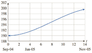
The approximating curve shown on the figure is given by
where t is time in months since the start of December 2004.
a. Use the model to estimate the monthly inflation rate in July 2005
b. Was inflation slowing or speeding up in July 2005?
c. When was inflation speeding up? When was inflation slowing? [HINT: See Example 3.]

Trending nowThis is a popular solution!

Chapter 5 Solutions
Applied Calculus


- The US. import of wine (in hectoliters) for several years is given in Table 5. Determine whether the trend appearslinear. Ifso, and assuming the trend continues, in what year will imports exceed 12,000 hectoliters?arrow_forwardHuman Growth The growth remaining in sitting height at consecutive skeletal age levels for boys is indicated in the next column. Sketch a graph showing the rate of change of growth remaining for the indicated years. Use the graph and your sketch to estimate the remaining growth and the rate of change of remaining growth for a 14-year-old boy.arrow_forwardUse the table of values you made in part 4 of the example to find the limiting value of the average rate of change in velocity.arrow_forward
- Temperature The graph shows the temperature T in degrees Celsius as a function of the altitude h in feet when an inversion layer is over Southern California. An inversion layer is formed when air at a higher altitude, say 300 ft, is warmer than the air at sea level, even though air normally is cooler with increasing altitude. Estimate and interpret the average rate of change in temperature for the following changes in altitude. a. 1000to3000ft b. 1000to5000ft c. 3000to9000ft d. 1000to9000ft e. At what altitude at or below 7000ft is the temperature highest ? Lowest ? How would your answer change if 7000ft is changed to 10,000ft? f. At what altitude is the temperature the same as it is at 1000ft?arrow_forwardImmigration The following graph shows immigrationin thousand to the United States has varied over the past century. Source: Homeland Security. a. Find the average annual rate of change in immigration for the first half of the century from 1905 to 1955. b. Find the average annual rate of change in immigration for the second half of the century from 1955 to 2005. c. Find the average annual rate of change in immigration for the entire century from 1905 to 2005. d. Average your answers to part a and b, and compare the result with your answer from part c. Will these always be equal for any two time periods? e. If the annual average rate of change for entire century continues, predict the number of immigrants in 2009. Compare answer to the actual number of 1,130,818 immigrants.arrow_forwardThe half-life of plutonium-244 is 80,000,000 years. Find function gives the amount of carbon-14 remaining as a function of time, measured in years.arrow_forward
- Population Growth and Decline The table gives the population in a small coastal community for the period 1997-2006. Figures shown arc for January 1 in each year. (a) What was the average rate of change of population between 1998 and 2001? (b) What was the average rate of change of population between 2002 and 2004? (C) For what period of lime was the population increasing? (d) For what period of time was the population decreasing?arrow_forwardThe fox population in a certain region has an annualgrowth rate of 9 per year. In the year 2012, therewere 23,900 fox counted in the area. What is the foxpopulation predicted to be in the year 2020 ?arrow_forwardBody Mass Index The following graph shows how the body mass index-for-age percentile for boys varies from the age of 2 to 20 years. a. Sketch a graph of the rate of change of the 95 th percentile as a function of age. b. Sketch a graph of the rate of change of the 50 th percentile as a function of age.arrow_forward
- Table 6 shows the year and the number ofpeople unemployed in a particular city for several years. Determine whether the trend appears linear. If so, and assuming the trend continues, in what year will the number of unemployed reach 5 people?arrow_forwardBody Mass Index The following graph shows how the body mass index-for-age percentile for girls varies from the age of 2to20 years. Source: Centers for Disease Control. a. Sketch a graph of the rate of change of the 95th percentile as a function of age. b. Sketch a graph of the rate of change of the 50th percentile as a function of age.arrow_forward
 Algebra and Trigonometry (MindTap Course List)AlgebraISBN:9781305071742Author:James Stewart, Lothar Redlin, Saleem WatsonPublisher:Cengage Learning
 Calculus For The Life SciencesCalculusISBN:9780321964038Author:GREENWELL, Raymond N., RITCHEY, Nathan P., Lial, Margaret L.Publisher:Pearson Addison Wesley,
 College AlgebraAlgebraISBN:9781305115545Author:James Stewart, Lothar Redlin, Saleem WatsonPublisher:Cengage Learning
 College Algebra (MindTap Course List)AlgebraISBN:9781305652231Author:R. David Gustafson, Jeff HughesPublisher:Cengage Learning
 Algebra & Trigonometry with Analytic GeometryAlgebraISBN:9781133382119Author:SwokowskiPublisher:Cengage