Videos
To analyze: the data and create a display that represent the data best and explain with reasoning.
Answer to Problem 9CT
Pie chart is best that can describe or represent the data.
Explanation of Solution
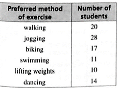
Given:
Concept used:
The angle measure for each section of the circle graph by multiplying the fraction of students by
Pie charts are specific types of data presentation where the data is represented in the form of a circle.
In pie charts a circle is divided into various sections or segment represents a certain proportion or percentage of the total. In this diagram, the total of all the given items is equated to
Calculation:
A circle graph is appropriate since it can show the data as parts of whole.
To find the angle measure for each section of the circle graph by multiplying the fraction of students by
Walking:
Jogging:
Biking:
Swimming:
Lifting weights:
Dancing:
This data can be Represents through the pie chart diagram as below:
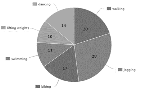
Hence, pie chart is best that can describe or represent the data.
Chapter 7 Solutions
BIG IDEAS MATH Integrated Math 1: Student Edition 2016


 Discrete Mathematics and Its Applications ( 8th I...MathISBN:9781259676512Author:Kenneth H RosenPublisher:McGraw-Hill Education
 Mathematics for Elementary Teachers with Activiti...MathISBN:9780134392790Author:Beckmann, SybillaPublisher:PEARSON
 Thinking Mathematically (7th Edition)MathISBN:9780134683713Author:Robert F. BlitzerPublisher:PEARSON
 Discrete Mathematics With ApplicationsMathISBN:9781337694193Author:EPP, Susanna S.Publisher:Cengage Learning,
 Pathways To Math Literacy (looseleaf)MathISBN:9781259985607Author:David Sobecki Professor, Brian A. MercerPublisher:McGraw-Hill Education