
Videos
A hygrothermograph is used by the weather services to record temperature and relative humidity (see Illustration 5). The lower part of the graph is used to measure relative humidity from 0% to 100%. The upper part of the graph is used to measure temperature from
F to
F. For example, at 8:00 P.M., the temperature was
F, and the relative humidity was 82%.
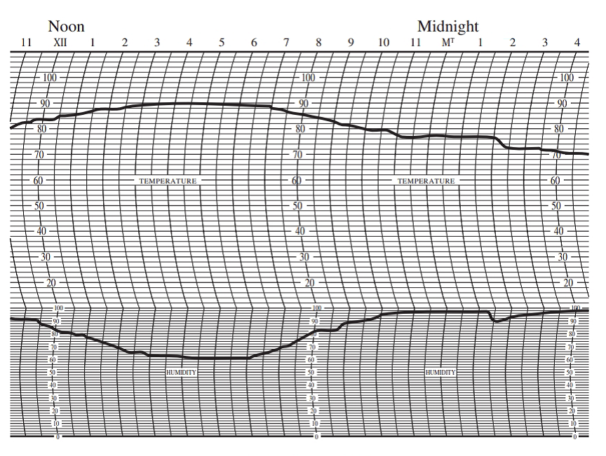
ILLUSTRATION 5
Hygrothermography (temperature in
Use the hygrothermograph in Illustration 5 to answer Exercises 9–14.
What was the relative humidity at 2:00 A.M.?
Want to see the full answer?
Check out a sample textbook solution
Chapter 15 Solutions
Bundle: Elementary Technical Mathematics, Loose-leaf Version, 12th + WebAssign Printed Access Card, Single-Term


- Read the decimal-inch measurement on the vernier height gage in Figure 41-2.arrow_forwardAhmed is investigating how long his phone's battery lasts (in hours) for various brightness levels (on a scale of 0-100). His data is displayed in the table and graph below. Brightness Level (x) 18 20 25 29 34 57 72 83 Hours (y) 5.5 7.1 7.8 6.4 5.5 4 1.8 2.6 10 7 10 20 30 40 70 100 50 Brightness Level 60 80 90 a) Find the equation for the line of best fit. Keep at least 4 decimals for each parameter in the equation. b) Interpret the slope in context. Ahmed should expect -0.0769 hours per brightness level. O Ahmed should expect -0.0769 brightness level per hour. c) What does the equation predict for the number of hours the phone will last at a brightness level of 25?arrow_forwardUsing all the data in the image, create the following graphs: 1. Histogram 2. Frequency Ogive 3. Box Plotarrow_forward
- Consider the graph below and answer For what month is the graphed temperature positive and closest to 0°?arrow_forwardProduce a bar graph that shows the effect of pH on the rate of reaction for amylase and examine the graph. Be sure to properly title your graph, label the axes, and provide a legend.arrow_forwardMake 2 bar graph using this data one for bpm and one for resarrow_forward
- Use the monthly average Rainfall and Temperature data to plot a typical Temperature-Rainfall graph (one graph, different plots and labels on either y-axis) of Port Moresby.arrow_forwardThis bar graph shows the stopping distance (in feet) for a car traveling at different speeds. Approximately how many feet would it take a car traveling at 40 ft/sec to stop? feetarrow_forwardThe graph below is the shoe sizes and heights (in inches) of 14 girls. Determine the strength of the relationship between shoe sizes and heights. Figure 2. Shoe Size 67.5959606162636465x shoe sizey Height x y graph A. Strong negative relationship B. Perfect negative relationship C. Perfect positive relationship D. Strong positive relationship Click to select your answer and then click Check Answer.arrow_forward
- Consider the graph below and Find the average of the temperatures shown for the months of January, September, and October.arrow_forwardAnswer question 10.30 in the picture and use 10.29 for reference.arrow_forwardThe Fahrenheit temperature readings on several Spring mornings in New York City are represented in the graph belowarrow_forward
 Mathematics For Machine TechnologyAdvanced MathISBN:9781337798310Author:Peterson, John.Publisher:Cengage Learning,
 Glencoe Algebra 1, Student Edition, 9780079039897...AlgebraISBN:9780079039897Author:CarterPublisher:McGraw Hill