
Concept explainers
Videos
The following graph shows the relationship between the numbers of cars on a certain road and the time of day for times between
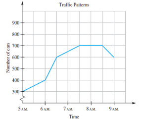
a. What was the increase in the number of cars on the road between
b. During which half hour was the increase in the number of cars the greatest?
c. What was the increase in the number of cars between
d. During which half hour(s) did the numbers of cars decrease? By how much?
e. The graph for this problem is composed of segments rather than just points. Why do you think segments are used here instead of just points?
Want to see the full answer?
Check out a sample textbook solution
Chapter 8 Solutions
A Problem Solving Approach To Mathematics For Elementary School Teachers (13th Edition)


- Table 6 shows the year and the number ofpeople unemployed in a particular city for several years. Determine whether the trend appears linear. If so, and assuming the trend continues, in what year will the number of unemployed reach 5 people?arrow_forwardEnter the data from Table 2 into a graphing calculator and graph the ranking scatter plot. Determine whetherthe data from the table would likely represent a function that is linear, exponential, or logarithmic.arrow_forward

 Glencoe Algebra 1, Student Edition, 9780079039897...AlgebraISBN:9780079039897Author:CarterPublisher:McGraw Hill
 Trigonometry (MindTap Course List)TrigonometryISBN:9781337278461Author:Ron LarsonPublisher:Cengage Learning
 College Algebra (MindTap Course List)AlgebraISBN:9781305652231Author:R. David Gustafson, Jeff HughesPublisher:Cengage Learning